Today I stopped by Target and picked a few retail packs of 2010 Topps National Chicle. So now we are going to tune into everybody's favorite (or forgettable) soap opera:
The Good, The Bad and the Ugly.
Pack 1
The Good

I think this Zack Grienke is the best card out of the packs I opened. The Artist is Don Higgins I think he did a great job of portraying Grienke getting ready to unleash a pitch to the plate.
The Bad

I would say that this is a spot on painting of D-Backs hurler Brandon Webb. Then I looked at the ears and it looks like Brandon should be traveling across Middle Earth as an elf.
The Ugly

This painting looks nothing like any other card or picture I've seen of Tommy Hanson. What's up with his nose?
Pack 2
The Good
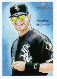
Good card of an up and coming player. Nice touch with the reflection of the diamond in his sun glasses.
The Bad

Another card of a great player. If it didn't say so on the card I don't think that I would know it was Torii Hunter. It looks nothing like him in my opinion.
The Ugly

A card of one of my all time favorite players, just doesn't look like him thats all. It looks like him. He has such a large chaw of tobacco in his cheek he looks like a chipmunk.
Pack 3
The Good

This is a very good portrait of Minnesota's favorite son Joe Mauer. Very good detail on his facial features and the chest protector. I'm not too sure about the green and yellow background, though.
The Bad

This is not a bad overall shot of Matt Kemp, but it looks like he just smelled something funky. It maybe the urine colored background the artist chose for him.
The Ugly

I'm really not sure who this painting was supposed to be of but the lettering text reads Manny Ramirez. Not even close!
The Review
Now I am not an art critic, but as you can see some of the cards are just bad bad bad. Yet others are great. I know that 2/3 of the cards in this post are in the bad and ugly categories but there are some really great looking cards in this set too. I really like the Greinke and a Jackie Robinson I didn't feature. But as a disclaimer, I came up with the idea for this review by my first reaction to the packs I opened. Some cards were Good, some were Bad, and some were downright Ugly. I won't be buying any more of 2010 Chicle mostly because I'm trying to save money to go to the National Sports Collector's Convention in August and my 2010 Bowman boxes should arrive tomorrow. But mostly because Chicle just didn't do it for me this time. Maybe Topps will improve the product for next year, or maybe not....
It's just too damned easy with these...I wasn't as kind...see my sidebar.
ReplyDelete